
Oglesby & Butler
Get this. The world’s leading manufacturer of portable ‘herbal’ vaporizers (yeah, we had to look it up too) tapped us and our partners at Thing Tank to help them create a category. Their previous vaporizer, the Iolite, was a huge, huge success. But it had a steampunk meets walkie-talkie vibe, and they wanted to reach out to a whole new demographic—basically design-savvy, urban consumers who wouldn’t be caught dead in a headshop. People like us. Or, as their brief put it, people who are hungry (or at least have the munchies) for a vaporizer that’s entirely at home in their home. Next to their iPhone. With Thing Tank taking the lead on user research (aka conducting a series of hilariously insightful ‘unfocused groups’), we worked with the client to firm up an all-encompassing brand brief—one that informed everything from material selection and color palette, to naming and tone of voice. And as the initial industrial design directions took shape, we shifted gears to executing on naming, packaging, identity, PR, and marketing. Given the response from Wired, The Wall Street Journal, The New York Times, Gizmodo, Core 77, Uncrate, and Lovely Package (among others), things clicked pretty much immediately.
Oh, and did we mention that the guys at Fab.com voted it top product at CES that year? Duuuuuuuuuude.
The Problem
—
Come on. Nobody really wants to suck smoke out of a plastic bag. Right?
Having not had a great deal of insight into the burgeoning marketplace for THC delivery devices, we were all actually pretty shocked when we started surveying the landscape. Things were CRAZY. Like, bipolar crazy. On the one hand, you had an overwhelming panoply of old-school maple wood pipes (with mother of pearl inlays) straight out of woodshop, a trippy array of swirly glass pipes (often shaped like dragons, skulls or sea creatures), and every possible permutation of alabaster pipe (think: Gandalf meets Wedgewood in Tijuana). And on the other hand, you had an emerging class of high-tech vaporizers that, to a one, looked more at home on the shelves of a biotech lab than on those of an Eames storage unit, next to your Sonos. And, on the vaporizer front, the level of complexity was completely overwhelming. Case in point, Oglesby & Butler’s first generation Iolite vaporizer needed to ship with an 80 page manual. Seriously. And so did basically every other model on the market. Which meant that, to partake, one needed to either reluctantly commit to embracing Haight Street headshop counterculture or get busy reading about how to judge the proper vapor density of the balloon on your Volcano—trying to tease out the facts from amid a surfeit of strangely euphemistic language designed to maintain a veneer of legitimacy (‘No really, officer, I bought this to diffuse essential oils’).


The Research
—
Or, as we liked to call it: ‘Unfocused Groups’.
Sounds cliché, but a certain unnamed brand of tortilla chips did play an uncannily important role in our first rounds of user research. With Chris Luomanen from Thing Tank taking the lead and deploying his IDEO super-powers, we gathered a few small groups of savvy users—and focused our unfocused time with them on sussing out the perceived quality of O&B’s previous model, the ins and outs of their own personal experiences (stigmas they felt, perceptions they wanted to break, etc.), and any possible improvements they would want to see in a new product. We gave them their own first-generation Iolite and asked them to use it privately for a week—taking notes as they went (and, yes, these notes did often include meandering observations about the overwhelming beauty of perfectly cooked pancakes). And then we brought them into our studio to talk through their experiences and share more specific thoughts/ideas while using the device in the moment.
Both on their own and in-person, these users expressed a range of reactions to using the Iolite for the first time. They both loved and hated it. Most raved about its portability, its effectiveness, how fast it is—and how discreet. But everyone had hard time telling if it was really working. Most just wanted more feedback from the thing—re: whether it’s on, how to light it, whether it was burning up all their ‘herbs’, etc. No one felt that it was as elegant or refined as it could/should be. And the overall take was that it was too flimsy, too light, too intimidating, and not ‘classy’ enough. Our take: the thing itself should be as amazing (to interact with) as it is effective. And that anything that reaches temperatures high enough to vaporize organic material needed to keep people in the loop about what it’s up to—especially when paranoia is, um, a factor.
And then we talked to a range of resellers in the space. In general, they were all pretty devoted advocates of the first-generation Iolite. And in most cases, largely due to its portability, functionality, and overall durability. They did point out clear areas for improvement—perceived quality being one. The actual feel of the object, in their opinion, needed to be more ‘expensive’ or ‘high-end’. And the styling could be, as they put it ‘improved from an aesthetic standpoint’. Also, the overall user experience needed a firm look (i.e.: ‘there’s not enough info about how full it is, what it’s doing, etc.’). The resellers we spoke to were also clear that the biggest untapped market (as they said it) was the ‘older, upscale, urban’ demographic—for whom simplicity, elegance, and perceived quality are key.
Lastly, we took a look at the competition. Ooof. Let’s just say that, at the time (and this was before the rise of Sparc or any of the other design-forward dispensaries, the bar was really, really low. Competitors tended to tell a very product-centric story and generally lead with functional specifications and/or scientific data re: the supposed health benefits of vaporizing. All deployed double-speak and super confusing, coded language (to avoid potential legal issues and/or enforcement action), and none told a particularly distinct or memorable brand story. At all. Bottom line: there was a huge opportunity for leaning into design, building a clear narrative, and standing out from the competition.
The Insight
—
Do this right, and these things will sell like, well, hotcakes.
Somehow, while nobody was paying attention, smoking weed had gone from being marginalized to mainstream. And the appropriate response was to take a lifestyle approach rather than a technical one. Sort of like how cupholders are more important than cylinders to most car buyers.
Anyway, for O&B, this would require thinking beyond the headshop. It would mean acting like the super-brands do and telling an aspirational, lifestyle story that’s backed up with an exquisite product experience (from un-boxing forward). To get there, they were going to need to get smart about building awareness and credibility in a marketplace that was crowded with sub-par (but ostensibly similar) products—one where education (re: both health benefits and functionality) is essential. Luckily though, their first entry had already built a ton of credibility on the functional front—now it was time to capitalize on that credibility and tell a bigger story. To do that, we needed to help them get a firmer grasp on what set them apart.
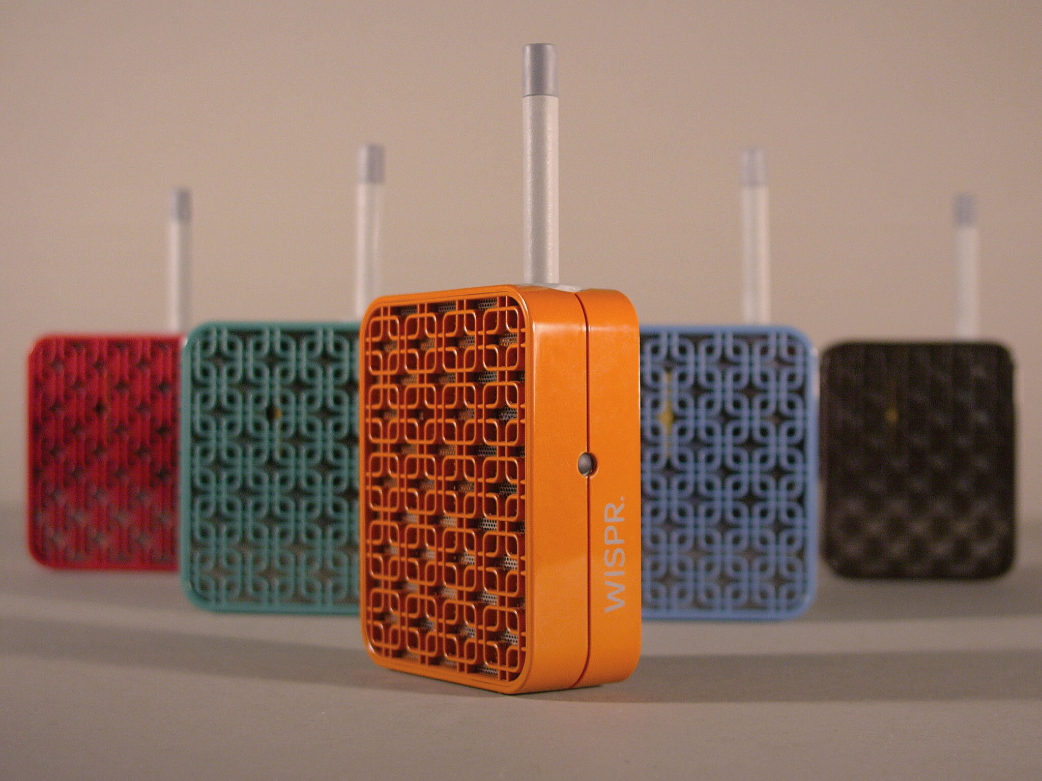
In the end, that all came down to four simple attributes: refinement, elegance, discretion, and covetablity. The product needed to be leading-edge without being overloaded with bells and whistles. It needed to be simple and refined—the result of serious time spent stripping things away. It needed to be at home next to your iPhone—smart, clean, cool, and contemporary. It needed to signal quality—it couldn’t feel like ‘paraphernalia’. It needed feel comfortable in context with the rest of your stuff. And it needed to offer opportunities for customization—both in terms of form factor, color, and (possibly) accessories.
The Answer
—
Make it brilliant but basic. And tell a killer story.
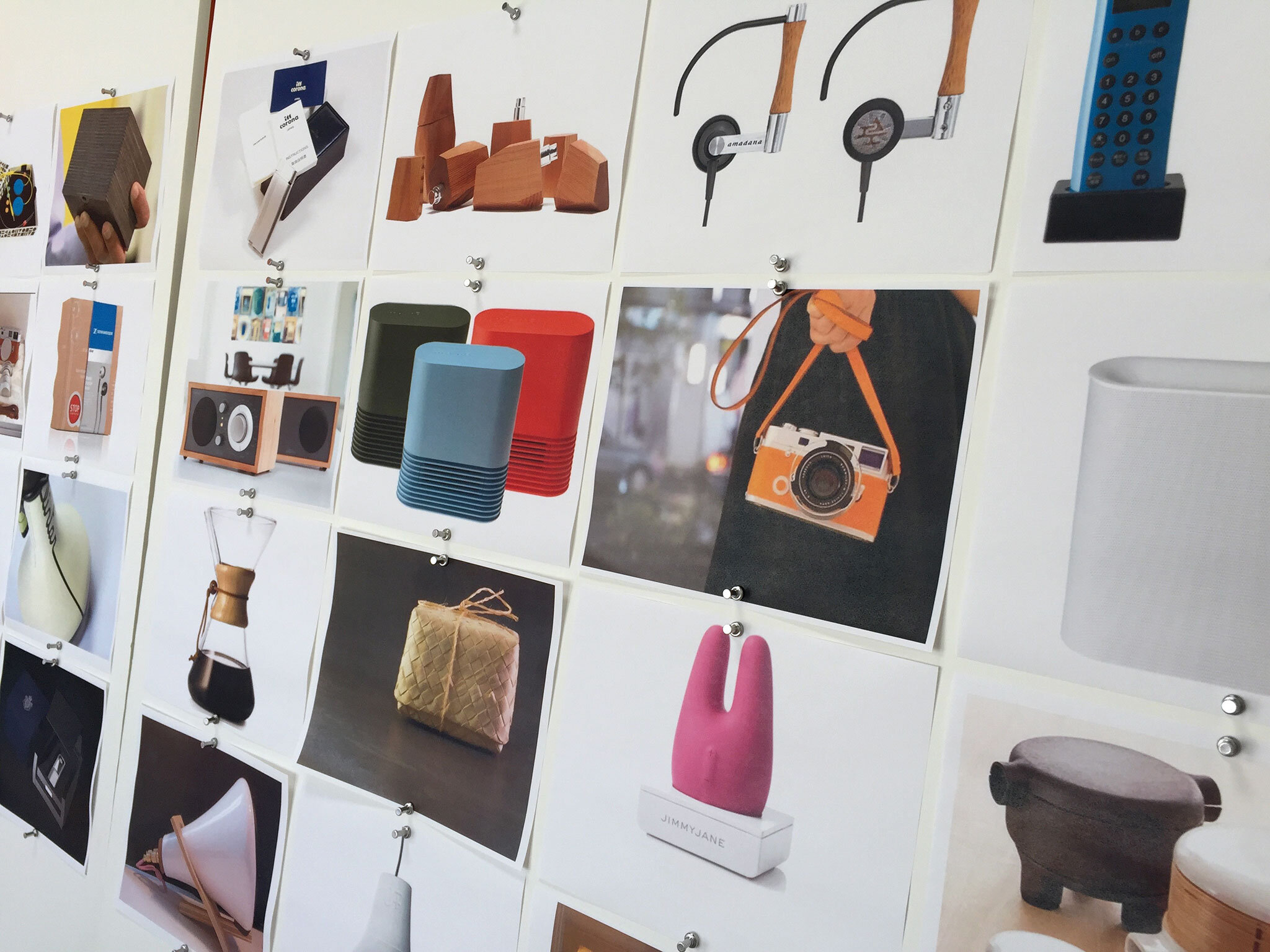
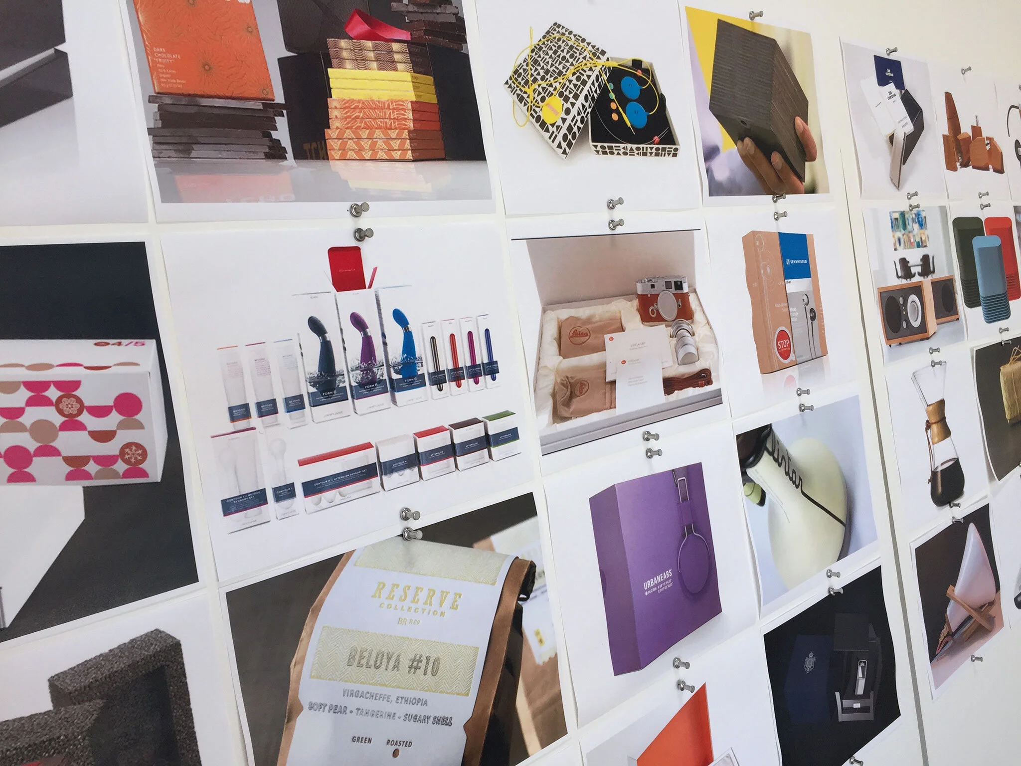
Here’s where the Thing Tank + Sequitur magic brought the most value to the client. After walking them through what we heard from consumers, what we saw when we looked at the competition, and what their vendors thought their next thing should be like, we helped them get to and agree on a set of parameters for brand and product experience that could inform every decision going forward (even after our work was done). Instead of diving straight into model making or CAD, we took a step back and surveyed the formal cues at play in the universe of high-end lifestyle design objects—from Leica M Series cameras to Bang and Olufsen headphones to Muji toasters. We had spent a fair amount of our in-person interviews trying to suss out what type of products said ‘luxury’ and ‘quality’ in a way that the current Iolite did not. And one consistent theme had emerged: it needed to be something people want to pick up and hold (without even knowing what it’s for exactly). It needed to feel ‘perfect’—something that’s comfortable in the hand and in close proximity to the face. And it should, ideally, be tactile and rich-feeling (from a materials standpoint). While adding weight to the object was basically out of the question, upping the production values via richer, more interesting materials and a more intriguing, distinctive form (that’s also practical and intuitive) was definitely in the cards.
And, from a brand standpoint, there was a ton of room to roam. Where the competition sounded largely stiff or furtive—using arcane, abstract language stripped or personality or full countercultural clichés—the new brand should be conversational and welcoming. It should be of the now. Smart but not technical. Savvy and, well, content. Stoked to be here and happy to invite you over.


Jumping ahead, we workshopped our way to a collective understanding of the value of packaging as a validator of purchase decisions. We surveyed the landscape of inventive form factors and investigated opportunities for signalling quality without sacrificing sustainability. Since we’d heard from resellers that the package itself needed to stand alone as a point-of-sales tool, we knew that it had to somehow showcase the product without being totally disassembled. It also needed to strike an entirely different tone from the rest of the products out there if it was going to resonate with the right consumer. And, from a practical standpoint, it needed to avoid the classic temptation of over-packaging. At the end of our mood sessions, we landed on a clear path forward: make it more personable, make it more engaging, and make it more precious. Signal ‘luxury’ and make it call out to be picked up, turned around, and held onto.


The Work
—
Explore, explore, explore.
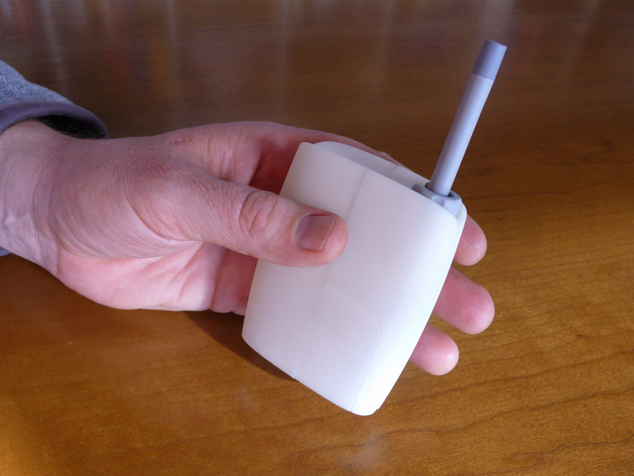
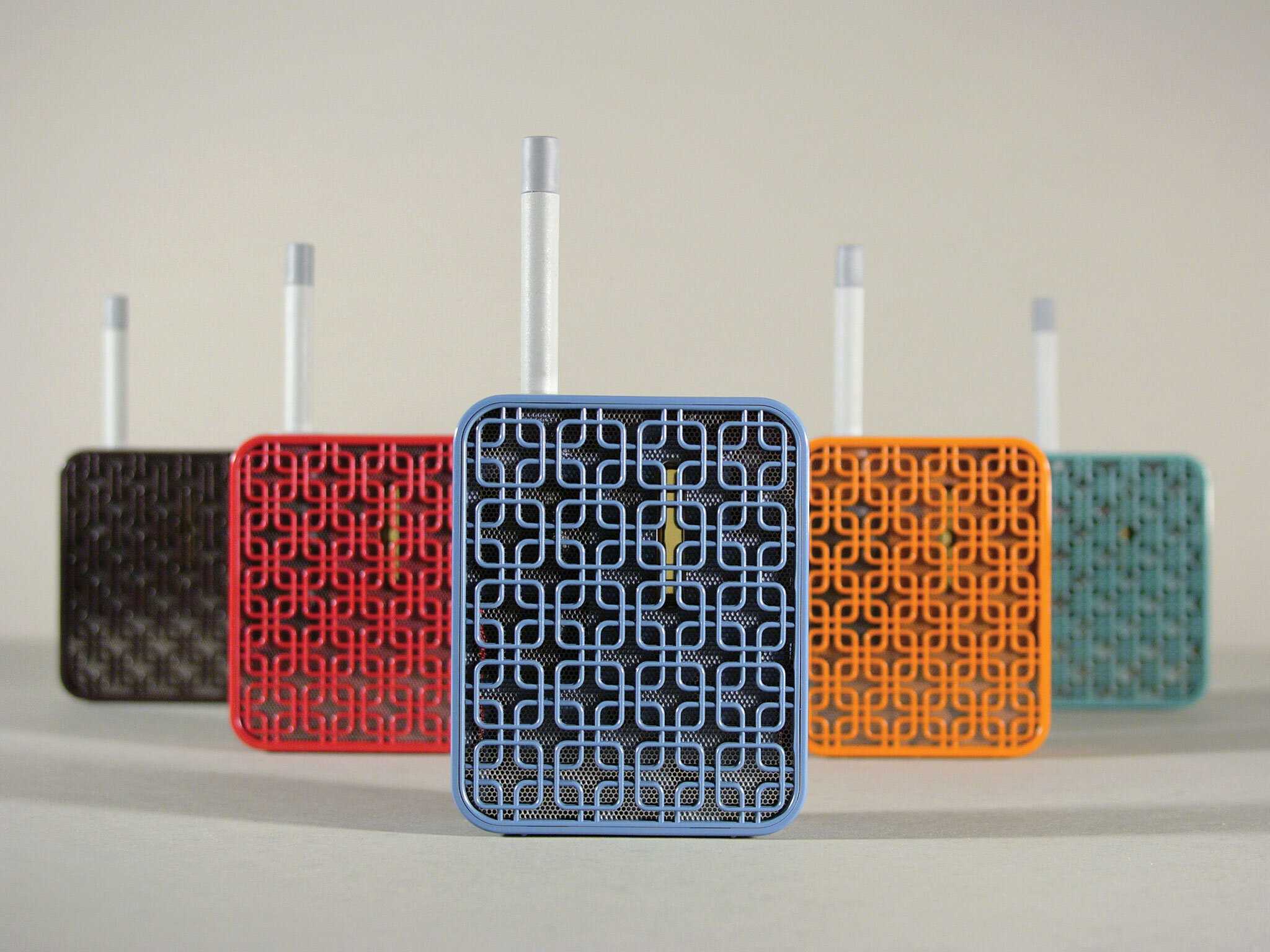
Having mapped out a clear trajectory, we and Thing Tank worked in parallel to prototype the product, iterate on the brand, explore campaign concepts, spitball digital/PR and social opportunities, and dive into packaging. After four rounds of exploration, model making, prototyping, and sharing CAD files with the manufacturing folks on the inside, we landed on a form factor that is radically streamlined, super-intuitive, and totally functional (the body of the object works as a heat-sink, cool to the touch even while hitting temperatures in excess of 374 degrees). And, after many more rounds of transatlantic filesharing, we were able to get to a final build of materials that accommodated every technical specification of their existing componentry, while at the same time demystifying every aspect of the user experience (from filling the device, to turning it on, to knowing when it comes to temperature, to turning it off). Finally, we had a device that gave clear feedback and felt resolved—totally of a piece with every other relatively high-end design object in nearly any upscale users life.


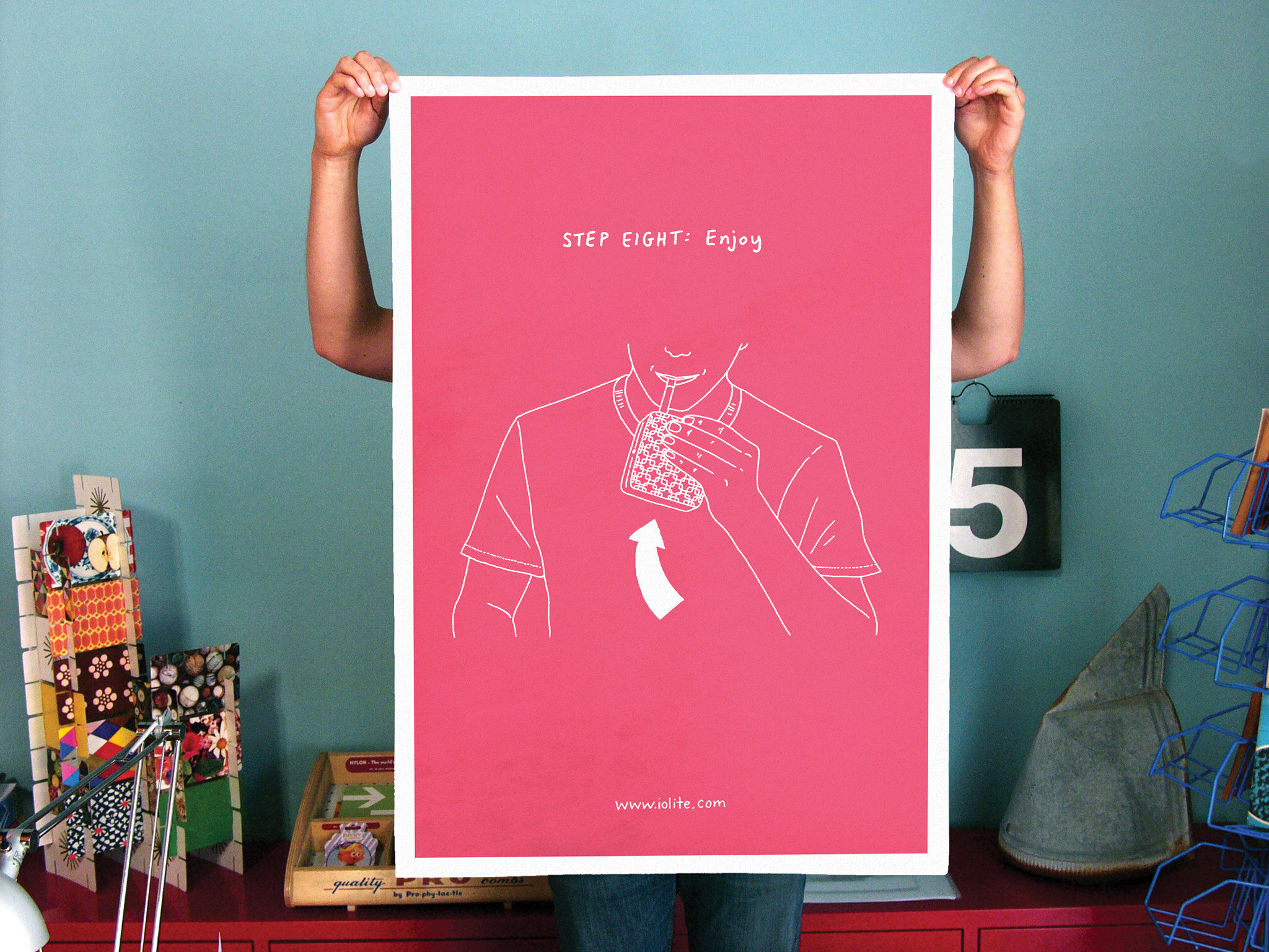
And, with the device itself nearly ready to go into manufacturing, we worked with the good folks at HQ to home in on an equally simple yet elegant package and a digital presence that announced the product (christened the WISPR) in a clever and personable way. Then, we brought in an upstart PR team to start pitch the backstory to everyone from Wired to the New York Times, and commissioned our pal Peter Arkle to illustrate a vastly streamlined user manual (from 80 pages to 10, not bad) that eventually became the anchor of a wild-posting campaign to build buzz for the big reveal at CES.
“The WISPR vaporizer is a bad habit made a little nicer—a stylish smoke-free smoking device designed by San Francisco firms Thing Tank and Sequitur. Besides the mouthpiece, would-be Harold and Kumars could enjoy their leaf of choice without attracting too much suspicion—thanks to the boutique-ready design and colors. Even this clean square found the design interesting enough to take a gander (a look, not a toke).”
Gregory Han, Apartment Therapy


The Ending
—
Presto-change-o. Brand new brand. Brand new category.
And the rest was history. Once we stepped back and let the PR pros work their magic, the story behind the WISPR took off like, well, not like wildfire per se. More like a finely-tuned heating element set to release pleasingly non-toxic, giggle-inducing vapor. Not only did Wired, The New York Times, Gizmodo, Core77, Uncrate, and Lovely Package pick it up and run with it, the guys at Fab.com named the Wispr the best new device at CES that year—beating out Nest (pretty nice for a product with literally no electronic components). And while we can’t legitimately say that our work had anything to do with the wave of design-led innovation overtaking the cannabis biz, we do like to think that we broke at least a few small barriers on this one.”
With Babeland and Dolby filling in two slots, O&B gave us the coveted branding trifecta: sex, drugs, and rock & roll.
What We Did